So to paraphrase Loyd Grossman I’ve deliberated, cogitated and digested my donor data and thought I’d share some of the big themes and patterns I’ve noticed.
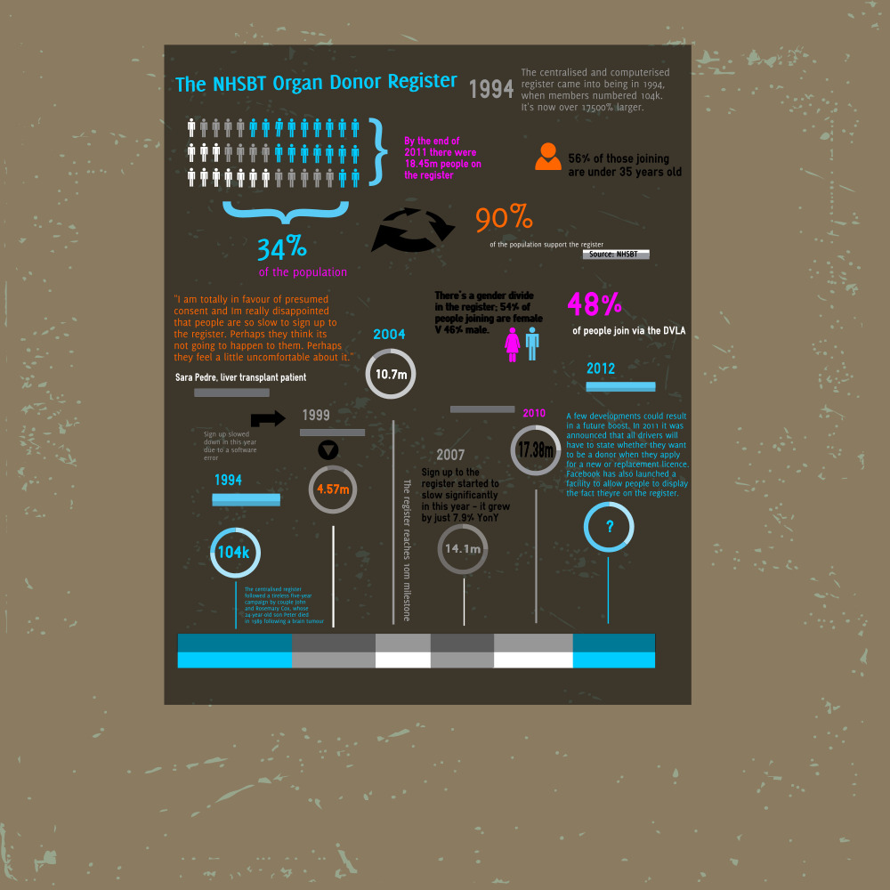
First, with its current total standing at 18.45m members, the register has grown massively since its computerised and centralised debut in 1994 – in that year it had just 104k signees.
But – and I have two big buts here…this only constitutes about a third of the total population and growth has practically flatlined in the last three years.
Contrast this third with the 90% that purport to support the survey when surveyed by the NHSBT.
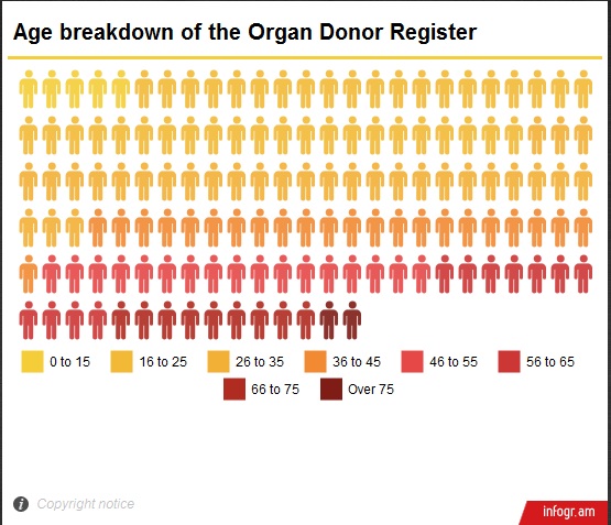
Another stark finding is that most people join the register in their 20s and 30s.
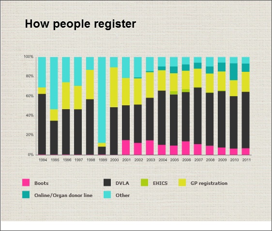
Given that most join via the DVLA, I surmise that the young demographic of the register is partly driven by the fact that this is the time that the majority of folk first get their driving licence. Which, in turn, leads me to assume that people need a nudge to join up.
Last year it was announced that all drivers will have to state whether they want to be an organ donor when they apply for a new or replacement licence. It will be interesting to monitor the long-term impact of this on register numbers.
This week Facebook also launched a facility to allow people to display the fact they’re on the register. I’d love to know what effect this will have but, again, I don’t have a crystal ball and that will have to be something to revisit in the future!
There is a bit of gender divide in membership. I wasn’t surprised, given well-documented reluctance of men to talk or act on any matter related to their health, to find that women dominate amongst new joiners – 54% versus 46%.
Scots make up the biggest slice of new joiners; and more Scots are on the register as a proportion of the country’s population too – 37% to be exact versus just 8.6% of the Channel Islands, and 24.5% of the West Midlands. This map took a lot of tweaking as it was hard to locate the Shapefiles for SHAs.

I think my next post might be my last but then I will talk about the less obvious trends; the ones that were only unearthed through cross-examination and dissection of the datasets. And I’ll tell you what my case-study and the NHSBT said to me about the information I’ve found.
And, one last thing, I tried some free infographic tools on the web – here are the fruits of my labour (very much work in progress).
Pingback: The Organ Donor Register – unearthing the subtle trends | Help Me Investigate Health