Basic CAR Skills
– ‘Computer Assisted Reporting’ is simply about using IT to gather and analyse data in way that allows journalists to produce original news stories.
– As Heather Brooke recently said, increasingly it is through CAR that journalists are finding their exclusives The first step, according to David Donald, in CAR is learning how to use a spreadsheet. I’m using Google Spreadsheets so you can view these figures yourself (they also offer nice tutorials on how to start using spreadsheets) Once you’ve got your set of data you’ll have something that looks like this;
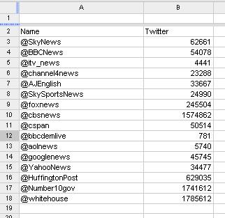
*This spreadsheet shows the number of twitter followers of major news organisations in the UK and US – and the White House and Downing Street to add some intrigue . This data however doesn’t really tell that much of a story – to find the interest we first have to establish a base on which to work from. This is done by ‘sorting’ the data. To sort – highlight all desired cells, click tools –> sort –> the column you want sorting (in this case it is B as I’m arranging the data by number of followers) –> select high-to-low/low-to-high –> sort, and you’re away.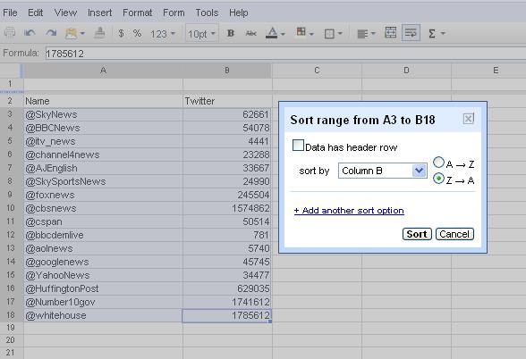
This then gives this;
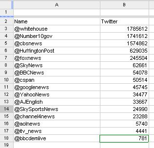 … which is a bit more interesting and you (and your audience) are now able to draw conclusions from the data. What this base also does though is direct you towards further lines of investigation.
For instance, this news services featured in this selection are extremely varied so a direct comparison isn’t really fair. One way then to assert who is currently using twitter to best effect may be to see who’s followers figures are increasing the quickest.
(Reporter tip: In most CAR, the really interesting stories lie in the ‘rate of change’ of the figures)
The first set of figures were taken on July 17th, now 12 days later we can see how they have increased.
… which is a bit more interesting and you (and your audience) are now able to draw conclusions from the data. What this base also does though is direct you towards further lines of investigation.
For instance, this news services featured in this selection are extremely varied so a direct comparison isn’t really fair. One way then to assert who is currently using twitter to best effect may be to see who’s followers figures are increasing the quickest.
(Reporter tip: In most CAR, the really interesting stories lie in the ‘rate of change’ of the figures)
The first set of figures were taken on July 17th, now 12 days later we can see how they have increased.
Using the ‘Formula’ box we can then enter a calculation that will work out the rate of change for each twitter account (as the answer is to go in cell D3, this cell must be selected first). THe equation for this is;
 Other ways to sort data –
– range =C3:C18 (difference between highest and lowest number)
Other ways to sort data –
– range =C3:C18 (difference between highest and lowest number)
– median = C3:C18 (the middle value – interesting to compare the average) Relevant tit-bits of information – – the AP style guide recommends giving numbers to 2 decimal places
– if you are starting with imprecise (often rounded numbers) then don’t use decimal places at all as this will only further distort the data
– audiences enjoy being able to see figures and do their own equations – so use the figures as much as possible and don’t clog up the report with unnecessary narrative (as I probably have with this).
– when requesting data, always ask for it un-aggregated and raw
– As Heather Brooke recently said, increasingly it is through CAR that journalists are finding their exclusives The first step, according to David Donald, in CAR is learning how to use a spreadsheet. I’m using Google Spreadsheets so you can view these figures yourself (they also offer nice tutorials on how to start using spreadsheets) Once you’ve got your set of data you’ll have something that looks like this;
*This spreadsheet shows the number of twitter followers of major news organisations in the UK and US – and the White House and Downing Street to add some intrigue . This data however doesn’t really tell that much of a story – to find the interest we first have to establish a base on which to work from. This is done by ‘sorting’ the data. To sort – highlight all desired cells, click tools –> sort –> the column you want sorting (in this case it is B as I’m arranging the data by number of followers) –> select high-to-low/low-to-high –> sort, and you’re away.
This then gives this;
… which is a bit more interesting and you (and your audience) are now able to draw conclusions from the data. What this base also does though is direct you towards further lines of investigation.
For instance, this news services featured in this selection are extremely varied so a direct comparison isn’t really fair. One way then to assert who is currently using twitter to best effect may be to see who’s followers figures are increasing the quickest.
(Reporter tip: In most CAR, the really interesting stories lie in the ‘rate of change’ of the figures)
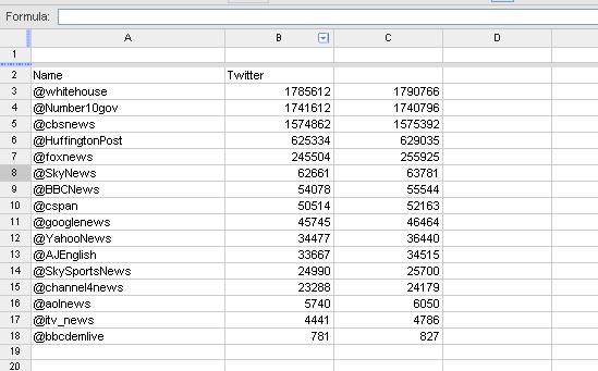
The first set of figures were taken on July 17th, now 12 days later we can see how they have increased.Using the ‘Formula’ box we can then enter a calculation that will work out the rate of change for each twitter account (as the answer is to go in cell D3, this cell must be selected first). THe equation for this is;
= (new number (C3) – old number (B3) ) / old number (B3)
which gives you;
=(C3-B3)/B3
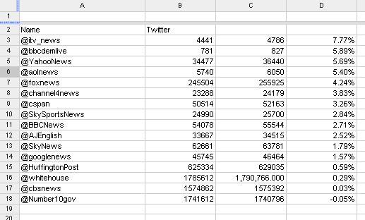
You can then use the the blue square at the bottom of the D3 square to drag that formula into all other cells beneath – giving you 18 ‘rates of change’ in a very short space of time indeed.
By then highlighting the D column and ‘sorting’ again, you can now see who is proportionately attracting new followers the quickest (highlight the column again and click the % box in the tool bar to put figures into percentages)
Other ways to sort data –
– range =C3:C18 (difference between highest and lowest number)– median = C3:C18 (the middle value – interesting to compare the average) Relevant tit-bits of information – – the AP style guide recommends giving numbers to 2 decimal places
– if you are starting with imprecise (often rounded numbers) then don’t use decimal places at all as this will only further distort the data
– audiences enjoy being able to see figures and do their own equations – so use the figures as much as possible and don’t clog up the report with unnecessary narrative (as I probably have with this).
– when requesting data, always ask for it un-aggregated and raw