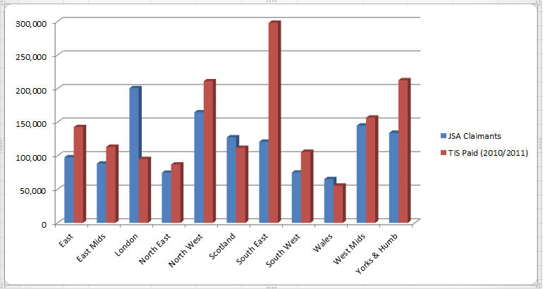
In our previous post, Oliver Conner analysed the number of jobseekers claiming JSA against the amount of Travel for Interview Scheme (TIS) money awarded in 2010/2011.
The JSA claimants’ figures are from 2010 (source: ONS) and the TIS data (source: DWP in a response to an FOI request) covers April 2010 to around August 2011. Of course we are comparing two different types of numbers: amounts of money and total numbers of jobseekers. But if you take the relative national value of those figures, it gives us a good idea of the regional differences.
I have created a chart using Oliver’s figures to facilitate visualisation. Continue reading JSA claimants vs.Travel for Interview – the chart
