Category Archives: data

Data: the “shambles” of Employment and Support Allowance appeals

Over on his Social Policy blog, Paul Spicker has a brief dissection of the most recent statistical release (January) for the review of Employment and Support Allowance:

“The implication is that we are likely to see over 320,000 successful appeals before this process is finished – about a fifth of all the former claimants of Incapacity Benefit. This will not be the total of wrong decisions, because a proportion of people who have been wrongly excluded will also be denied benefit; it will only be the decisions that have been proven to be wrong, after the DWP and claimants have been forced through an expensive and time-consuming appeal process to set things right. This is a shambles.”

If you need help investigating this further, let us know.

UPDATE: In the comments Paul adds the following:

“While I’m pleased by the widespread circulation of this posting, this was only a quick, back-of-the-envelope calculation, and I cannot hold to it with any degree of confidence. In particular,
* the rate of decision-making has slowed
* the statistical information in the tables does not cover the same time periods, and none of the information is fully up to date
* the level of new appeals seems to be falling
* the success rate seems to be falling, and
* large numbers of appeals appear to be disappearing from the process without explanation.
“That does not undermine the general point, that very large numbers of cases are proving to have been wrongly decided.”

Data: Welfare spending breakdown

The Labour blog Left Foot Forward provides a useful breakdown of UK welfare spend that demonstrates where most of the money is going, and how that might be shaping government policy.

Despite the spin on unemployment and immigration, for example:

“Almost half our welfare expenditure, all £78.4 billion of it, is spent on our ageing population. And the number of people drawing a state pension is ever-growing”

Benefit and tax credit expenditure, 2009-2010

Next, “A breakdown of [the 22.08 per cent of welfare expenditure that goes to workers on low incomes] shows an enormous focus on housing, which explains the increased attention on housing benefit:”

Welfare expenditure for people on low incomes, 2009-2010

Simple, but useful. Sadly, there’s no link to the raw data. Interestingly, in looking for that I found this website on UK public spending – created by left wing blogger Christopher Cantrill. As both of these sources have a self-declared political orientation, it’s worth tracking the source of the data, declared here.

(By the way, regarding political bias: if a source has declared it, that doesn’t mean their information is not valid, only that you need to check the information. If a source has not declared a bias, you should always assume they have one, and still check the information.)

Can you add anything more?

Data: limited housing availability following benefit caps

The Guardian is following the caps to housing benefits with data on the limited housing now available across the country to “job seekers [, the] disabled, lone parents, others unable to work such as pensioners or those in low paid employment.”:

“The study shows in many parts of the country there will be thousands more welfare claimants than there are properties that can be afforded by benefits alone – raising the possibility that the poor will be compelled to migrate to “benefit ghettoes” along the coast or in the north. Try for yourself by clicking on the accompanying map – for example Brighton and Hove shows”

Help Me Investigate Health contributor Carl Plant has already visualised some of the data here.

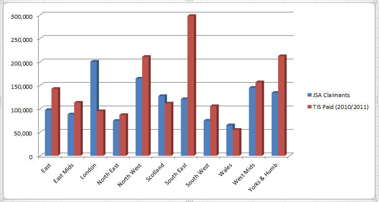
JSA claimants vs.Travel for Interview – the chart

In our previous post, Oliver Conner analysed the number of jobseekers claiming JSA against the amount of Travel for Interview Scheme (TIS) money awarded in 2010/2011.

The JSA claimants’ figures are from 2010 (source: ONS) and the TIS data (source: DWP in a response to an FOI request) covers April 2010 to around August 2011. Of course we are comparing two different types of numbers: amounts of money and total numbers of jobseekers. But if you take the relative national value of those figures, it gives us a good idea of the regional differences.

I have created a chart using Oliver’s figures to facilitate visualisation. Continue reading JSA claimants vs.Travel for Interview – the chart

JSA claimants vs Travel for Interview Scheme: can you map this data?

Joining in our investigation on the demise of the Travel for Interview Scheme (TIS) this week, Oliver Conner researched the number of Jobseeker’s Allowance claimants around the country and compared those figures against the amount of TIS being paid out by region.

His analysis reveals some interesting stats: the South East has been awarded the most amount of TIS by far, whereas the highest numbers of JSA claimants are concentrated in London.

Below is a breakdown of the figures. Oliver obtained this data from the Office for National Statistics (ONS) using a tool called Nomis.

Can you map this data, perhaps comparing it to poverty stats in the country? What is the co-relation between wealth, number of JSA claimants and the amount of money JobCentres spent on Travel for Interview for jobseekers? Anyone up for the challenge? Get in touch.

Region JSA Claimants(Source: ONS Nov 2010) % of total TIS Paid (2010/2011) % of total Discrepancy
East 97,790 7.56% £142,739.00 9.50% -1.94%
East Mids 88,420 6.83% £113,216.00 7.54% -0.70%
London 200,640 15.50% £95,115.00 6.33% 9.17%
North East 74,780 5.78% £87,027.00 5.79% -0.01%
North West 164,720 12.73% £211,048.00 14.05% -1.32%
Scotland 127,440 9.85% £111,827.00 7.44% 2.41%
South East 120,880 9.34% £297,968.00 19.83% -10.49%
South West 75,000 5.80% £105,835.00 7.04% -1.25%
Wales 65,150 5.03% £55,559.00 3.70% 1.34%
West Mids 144,930 11.20% £156,750.00 10.43% 0.77%
Yorks & Humb 134,290 10.38% £212,490.00 14.14% -3.76%
1,294,040 £1,589,574.00

Cuts to disability benefits: how is your local authority coping?

As part of its austerity measures, the British government is making cuts on several welfare benefits. One of the affected groups is Britain’s 10 million disable people (figures provided by the Disabled Living Foundation).

How serious is the situation in your local area?

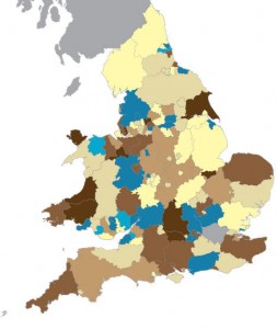
The independent think tank Demos, has mapped out their research data in the area, which allows us to check how well (or badly) each local authority in England and Wales is coping with the budget cuts to disability services. They were ranked as very good, good, well, ok, poor, bad or very bad.

The methodology Demos used to analyse the data and produce a nationwide picture is explained here.

Testimonials compiled on the False Economy site by people affected by the government cuts try to give voice to the current crisis, but more needs to be done.

The Where’s the Benefit campaign put out a call for disabled people in the UK to join their local “Occupy” groups  for a couple of hours every Sunday afternoon and raise awareness on how the welfare reform bill and its proposed cuts are affecting them. WtB also compiled, in a podcast, stories about  the role the Disability Living Allowance (DLA) plays in a disabled person’s life (#myDLA hashtag on Twitter).

In our previous post, Paul Bradshaw wrote about the Department of Work and Pensions’ press release claiming disability benefits were paid “without checks”. The press release triggered several media articles, but published DWP figures were interpreted widely differently on The Daily Mail and The Telegraph. The discrepancy was unpicked on the Left Foot Forward blog.

Have you or a loved one, been affected by cuts to disability benefits? Does the Demos map inspire you to collaborate with an investigation in this area? Would you like to ask Help Me Investigate Welfare to investigate any specific issues/facts/figures? Do you know someone who is already doing that and would like to introduce us to them? Are you good with video cameras and would like to get some live interviews with disabled people joining Occupy on Sundays?

You do not need to be a journalist or researcher in order to help; we will give you guidance and tips. Leave a comment, get in touch.

Links: Disability benefits paid “without checks”? The statistics debunked

Ruth Barnett writes about the Department for Work and Pensions press release with a particularly nastily-spun statistic (bold in original):

“The vast majority (94%) of new claimants got the benefit without having any face-to-face assessment of their needs.”

Ruth writes:

“The rest of the release paints a more complex (or to be less diplomatic, potentially contradictory) picture.


“It seems 42% of claimants had a statement from their GP verifying their medical condition; a further 36% submitted other sources of evidence, a category that can include reports by social workers or occupational therapists.


“Surely a GP is a “healthcare professional”? And surely all these trained staff will have met the claimant in person? Does this not count as a form of assessment? Apparently not.


The DWP’s figures show 16% submitted a claim form alone.”

Ruth got a response from the DWP, who do not feel their statements were misleading. Those statements include a quote from Secretary of State for Work and Pensions Iain Duncan Smith that “At the moment hundreds of millions of pounds are paid out in disability benefits to people who have simply filled out a form.”

She points out:

“The DWP figures show the cost of new claimants who really did just fill in the form last year was […] £30m.”

Also debunked and unpicked on Left Foot Forward.